Redesigning Oxford English Dictionary App (OED)
Table of Contents
Project Aim and Goals
I chose to redesign the Oxford English Dictionary app since is a brand I trust and I would love to have a product that matches my expectations. I love learning new words in English and their correct pronunciation. I have paid their products before and I love their app “Say It” (until it stopped working on my phone and tablet). Oxford dictionaries were my go to when I was younger and had several of them in my bookshelf.
The reason I wanted to embark myself in this project is to prove myself and the professional environment my work flow, my approach to redesign and my data research abilities in order to position myself as a valued UX UI designer in the industry.
The roles I assumed during this project were:
- User Researcher
- Data Analyst
- Graphic designer and vector illustrator
- UI/UX Designer
The software used during this project was Figma and Adobe Illustrator or similar for price reasons.
Disclaimer: I do not work for Oxford Languages, and the views from this case study are strictly my own. I don’t have access to all the user data that influenced their current design and as a result, this case study is only as exhaustive as it could be with the data I had.
Understanding the company
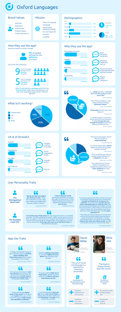
Values & Mission
When I was at school I chose Oxford English dictionary instead of buying any other because I thought of it as quality & trust in my learning experience. But don’t take my world for it, lets see what the company says:

Now lets look at the words used, pay special attention to the ones highlighted in bold:
“We are the world’s language data experts, investing over 150 years of experience and technological innovation into delivering authoritative, evidence-based content for languages around the world.
In our mission to unlock the power of language for learning and for life, we have developed beyond the role of a traditional dictionary publisher, providing our language content in more versatile and accessible formats for building and sharing language knowledge worldwide.”
So to summarise and get a better understanding of the company, lets group them in values and mission:
Values
Expertise, experience, authoritative, evidence based, aka trustworthy quality source (told you). It is, as well as the most used source. As a proof of it, try and search for a word meaning in google, the definition given is from OED.
Mission
Share language knowledge worldwide. Teach and make learning versatile and accesible.
Wait? Did they also say technological innovation? Surely not. Well, they did and that’s what I am here for!
App purpose & what do they want to achieve with it
I’d imagine they would like to comply with their mission and values on a more technological and accesible level but their current app doesn’t show any of these values and mission. It is not easy to use and it doesn’t convey quality nor trust.
My aim would be to serve the customer and the company, redesigning an app that it’s true to it’s brand and provides the user with an enhanced usability. This would result in increase usability and downloads, making OED a language reference not only on paper but in the digital world.
According to this created my own briefing:
To achieve this I wanted to level up OED to a Duoligo popularity. If Duolingo is to learn languages, Oxford dictionary is your trustworthy source to expand your knowledge further and differentiate yourself from the crowd. You use Duolingo to learn to communicate in a different language, you use OED to fit in in a different culture. You are able to learn more advance words, their grammar and pronunciation. Translate you own sentences and more. Unlike Duolingo, OED would work as an easy day to day database where you can search, save and come back to. I, as a user of both, can see a very different need in the market but as strong need for both nevertheless.
My User Research And Data
So I started to notice a very distinguishable market when I did my comparison with Duolingo, but lets actually have a look at who are the people that already use the app and who could we bring in (our brief was to brooding up our user demographics).
What are their reasons for using the App?
So looking at the app ratings in Apple’s App Store, users think it’s not actually that bad. Is it just me then? There are approximately to the this date 14.3K reviews and the app has a 4.6 out of 5 star rating. Let’s take a closer look.
I analysed around 30 reviews from Apple’s App Store (you can download my working file here), filtered the positive ones (5 and 4 star reviews) and picked up the most used words in order to start to paint the picture.
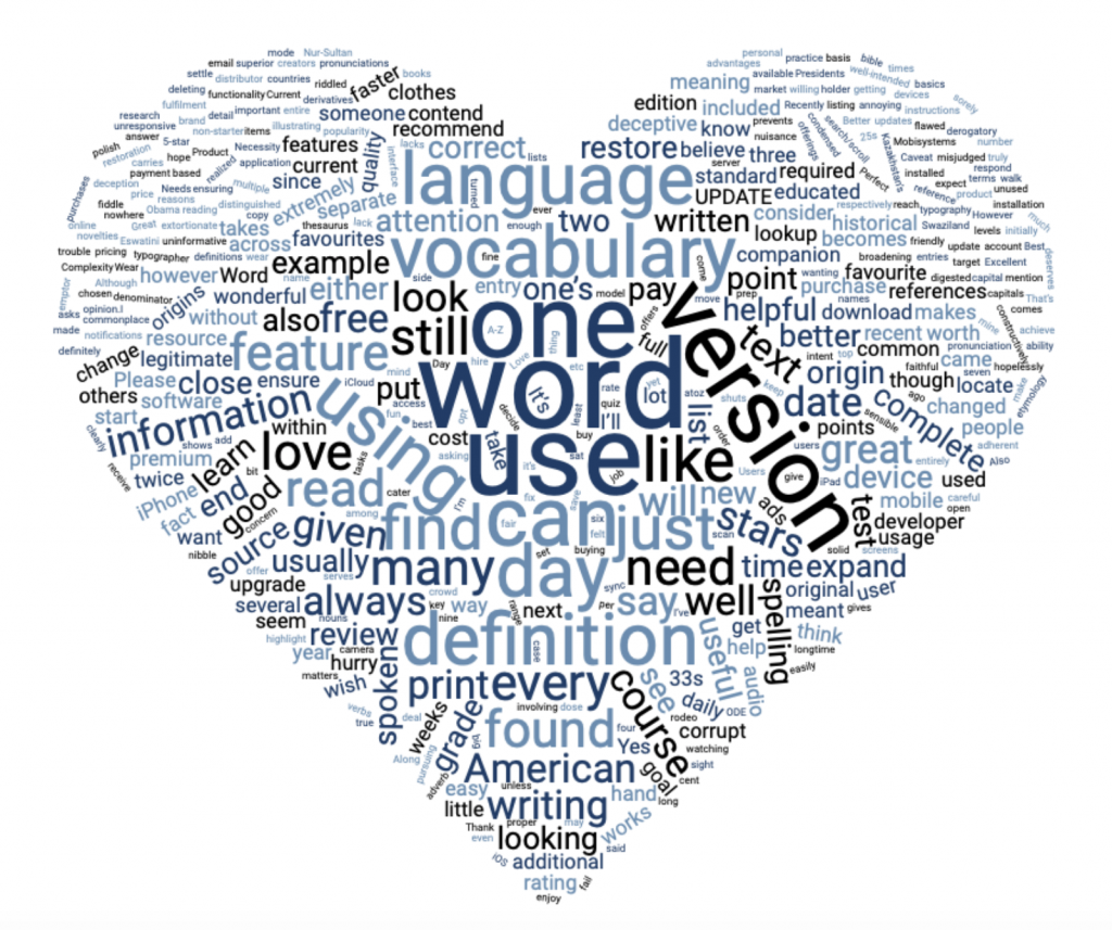
The above is a word cloud of the positive reviews (5 and 4 star reviews). Note: words like OED, Oxford, English and Dictionary were taking out the world cloud to get a better understanding of people’s use as these were clouding the rest and were not informative, just stated the name of the app.
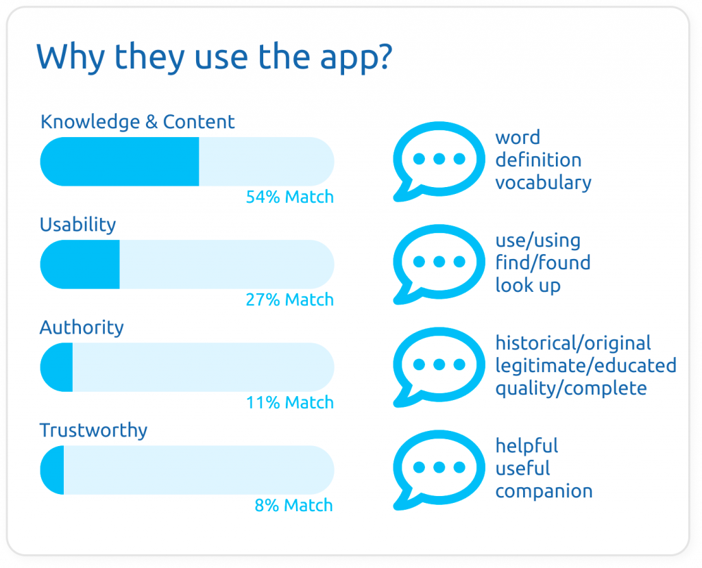
By looking at the word cloud you can already see some patterns coming up. I grouped the most used words in four main themes. The main reason to use the app is the content knowledge it provides. Looking up for words and its definitions. Always finding what you want and getting a legit complete definition. I was happy to see words like historical, legitimate, companion that I could use to group in the brand core values and get an overall feeling on how users were perceiving the brand. Although it was nice to see some of the brand values come up, the use of these terms is still low, even more considering this results are only taking in account positive reviews (4 & 5 star reviews).
From the information gathered I could already tell the most used feature is the dictionary. OED also provides translation, pronunciation, thesaurus, etymology (word origins), use over time and grammar information. Even so, I wanted to dig a little deeper and I had a quick look a Google Trends. I know most people would just search the word in google instead of downloading an app, but do they look for definitions? translations? pronunciations? Let’s see.
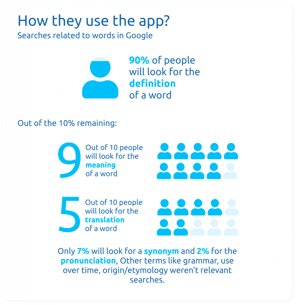
Graph at the left. Source: Google Trends, average of terms search worldwide last year.
So makes a lot of sense that the majority of the happy reviews were talking about finding words and their definitions. These people have already some sort of history with the brand and trust it as a legitimate source, they use the app as a practical companion to search the words they come across in their day to day life. I will get more into it further down when looking at user personality traits.
What Keeps them coming back?
Definitely the history they have with the brand and its content which is always complete and can be trusted.
What Isn't working?
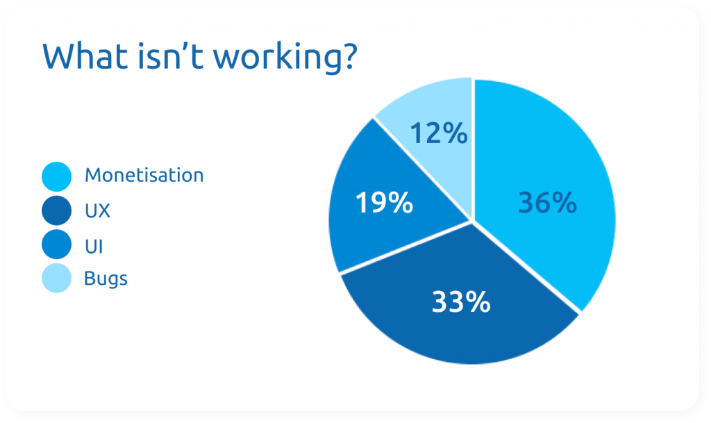
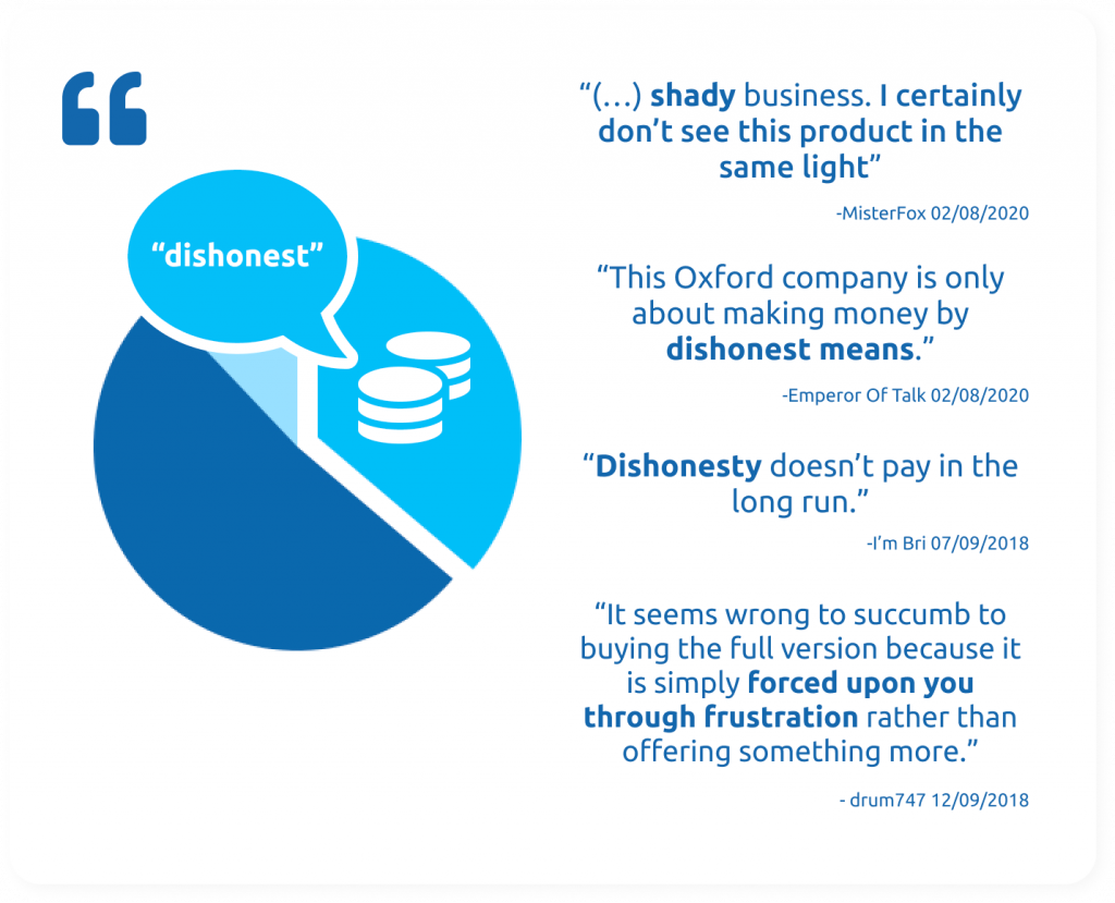
1. Brand shown as dishonest
When I look at the most critical reviews, I can see most of them are annoyed about the monetisation of the app. As an UX/UI designer is a little out of scope to decide wether the app has to have a paid subscription or not but reading into the comments you quickly notice people would happily pay if the app was worth it.
In addition, the most annoying thing about the subscription requirement isn’t the money but the “dishonest and aggressive” way in which is forced upon users.
That does have to do a lot about user experience. The user tell us that if the experience in using the app was up to their expectations they would pay! In fact most of them did before the actualisation. Many complain about having to pay again (25% of critical users) as the app doesn’t do a good job informing on how to recover your subscription and some don’t feel like it’s worth the price specially after the UI changed and became more messy. Specially when “you can go to google and search up or your phone built in dictionary” as one user stated. Furthermore, the dishonest and forced way in which it’s presented loses brand authority and damages the brand image.
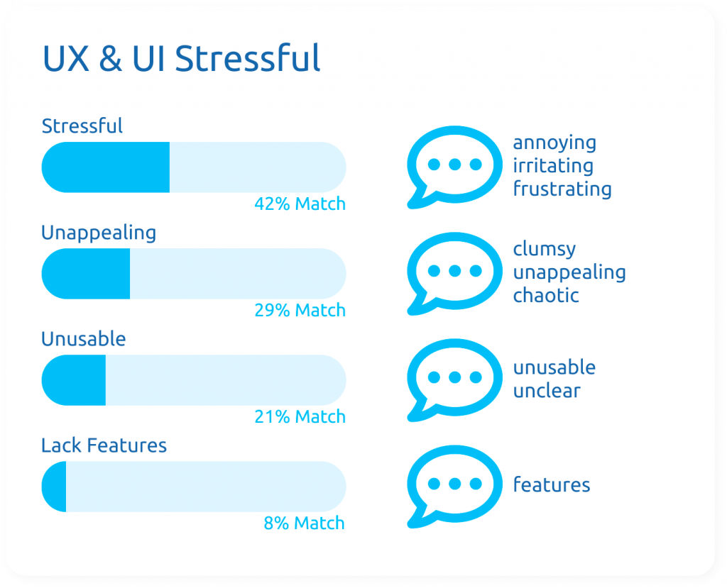
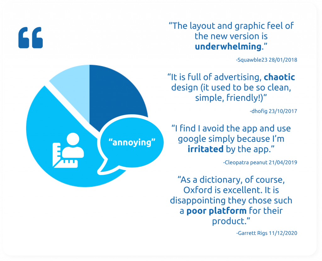
2. UI & UX is stressful
A 34% of critical users describe the UI as being a pain, specially with the rate 5 star pop up.They also complain about their interface being messy and unfriendly, poor usability, unclear icons and lack of features.
3. Bugs
Even though bugs and technical issues are out of scope on this project, the most mentioned were: favourite/saved words being deleted, lagged screens and search and some unclear pronunciations when hearing the words. This last one was specially annoying as you are charged for it, as well as translation features.
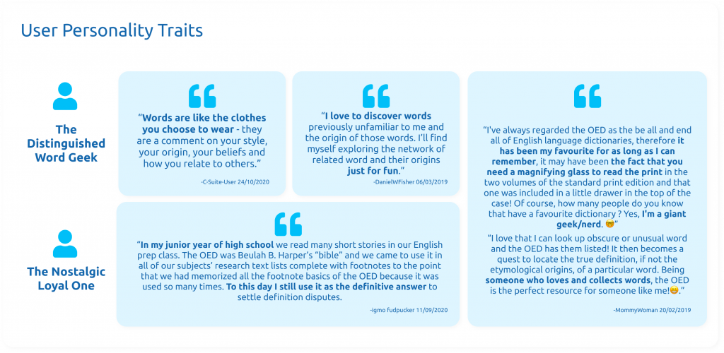
What does a typical user look like?
User's Personality Traits
After analysing user reviews, I came across two different personality traits which I called “The Distinguished Word Geek” and “The Nostalgic & Loyal One”.
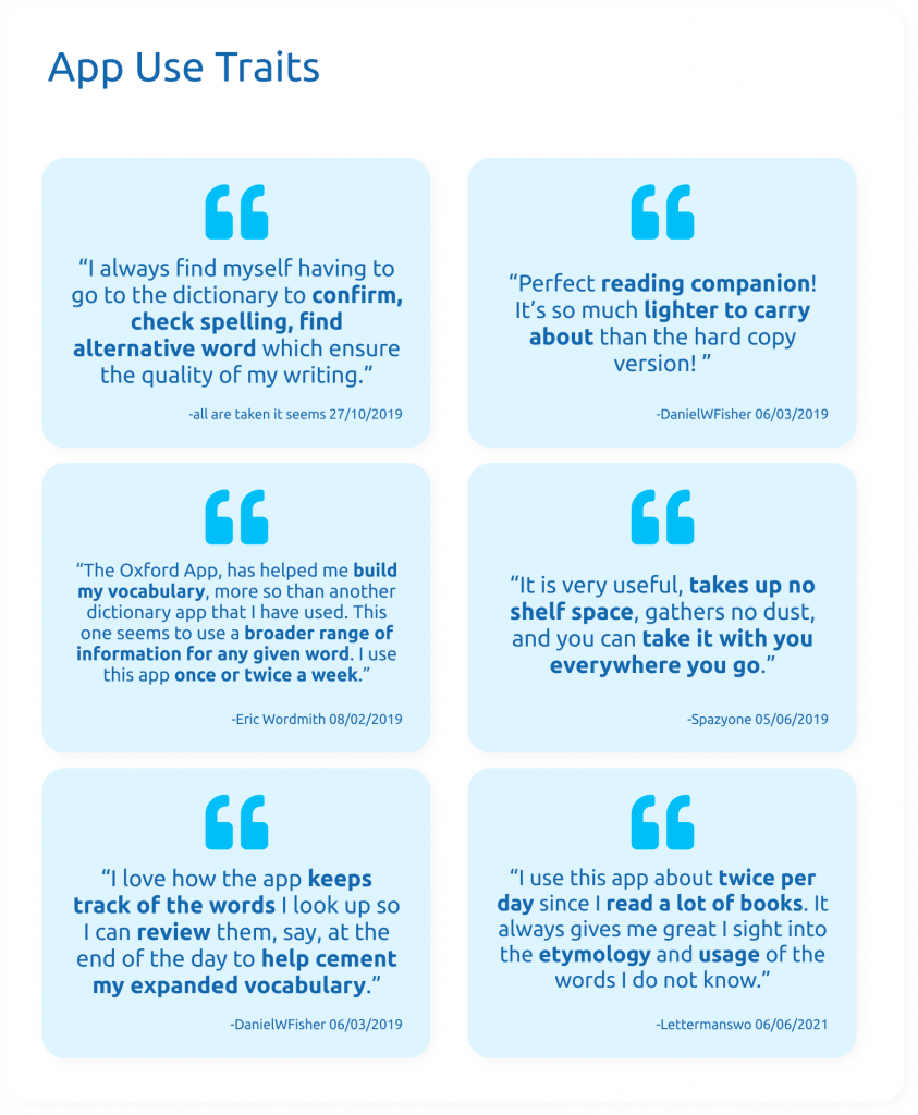
User & App Relationship
I also analysed how users related to the app. With this info I was able to create user personas.
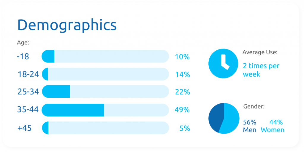
Demographics
I also used all this information to pull together some made up but informed demographics. It was impossible for me to get this information from the user reviews.
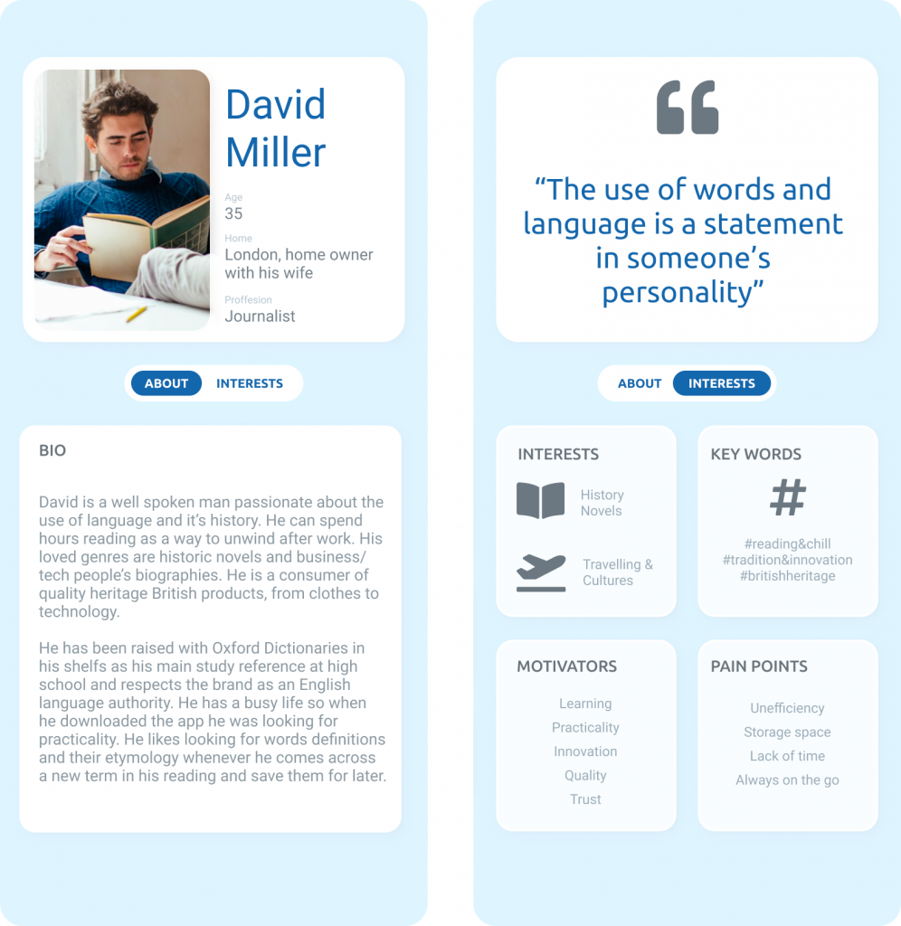
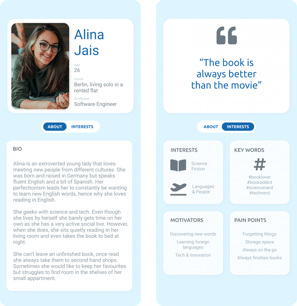
User Personas
App Redesign
Experience #1 : The Home Page
Assessment of Oxford Dictionary’s current home page
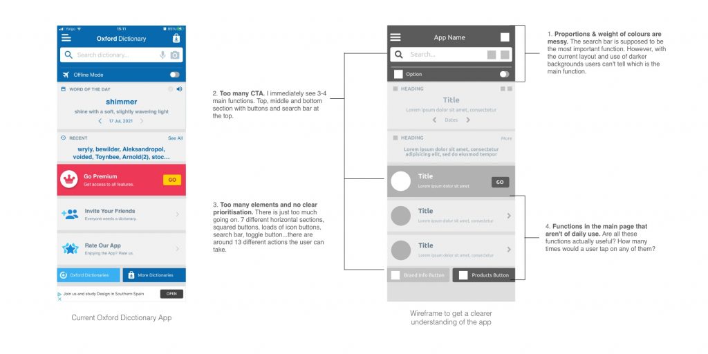
problem 1. Proportions & weight of colours are messy
The search bar is supposed to be the most important function. However, with the current layout I can’t tell which is the main function. The search bar section is a very tiny percentage of the whole screen (20%) which doesn’t help to tell the user where to go first. Although in grey scale it is the darker shade, on full colour the user can get distracted with the subscription ad that appears in different colours (right now in red background – as brighter & attention seeking as it can get). Similarly, the bottom right button is in the same shade as the search section almost making them equal in prioritisation. As an additional note, items aren’t even properly aligned.
Problem 2. Too many CTA
I immediately see 3-4 main functions. Top, middle and bottom. This is because those areas have a darker background and they include buttons or a search bar. This is confusing to the user, making them make more eye fixations screening the home page wondering what to do.
Problem 3. Too many elements and no clear prioritisation
There is just too much going on. 7 different sections, squared buttons, loads of icon buttons, search bar, toggle button…there are around 13 different taps the user can make only on this screen. It is not surprising that the user can feel quickly overwhelmed and wants to exit the app. Add the ad pop ups coming up and you really want to get rid of this app asap!
Problem 4. Many functions in the main page aren't of daily use
Are all these functions actually useful? How many times would a user tap invite a friend, want to find more about the brand, download more products. You definitely are only going to rate the app once and I wouldn’t want to encourage people to rate it in this current state for sure. Maybe you’ll invite a friend once in a while… but surely not a daily use function.
User Experience Diagram
To summarise a user downloading the app and seeing it for the first time. First thing they would have to screen the whole page creating loads of eye fixations in main points of attention like darker backgrounds (top middle and button sections), then their eyes would screen all the CTAs (buttons, and search bars) and then finally they would start to type in a word on the search bar at the top of the screen. Oh no wait! Ad pop up, press cross..Now, let’s search.
Solution 1. Search Bar At The Centre Of The Screen
Make the search bar the main point of attention. Now, it is clear where you need to type the word to search it in the dictionary. I did this by simplifying the home page having as little elements as it could and bringing the search bar to the centre of the screen. Creating a blue background to bring the brand colours into it and to be able to make the search bar in white to stand out. Now you can see the main function clear, followed by the top icons to go even further.

Redesigned home screen
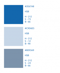
Solution 2. Choose Of Colours
In order to simplify the main screen, I’ve picked one main theme colour and used variations to it. The OED had two main blue colours, I felt using the two would be too much, so I chose the one that I can most relate to the brand, the one their physical dictionaries use, the dark blue. The other blue was also too vivid, which would be uncomfortable to see on a screen, edges would be blurry and probably not the best option for those with impaired vision.
The other colours used are lighter versions of the same hue. So lowering the saturation and turning the brightness up. This way we keep it clean and simple.
The first lighter version is used to draw attention to a specific clickable element, like choosing what type of search. The second version is a darker version of the first. It is used to show an inset on the item as when the user hovers on a word from the suggested entries.
This way we prioritise elements, first drawing the user attention to the white search bar, followed by the type of search at the left and the top screen icons.
Experience #2 : Other features on the home page
Problem 1. Secondary features were crowding the home page
As mentioned above the home page contained too many CTAs and most of them weren’t used on a daily basis. Remember from my research most people looked for a word meaning (9 out of 10) followed by a translation (5 out of 10 people) Less used were looking for a synonym or pronunciation.
Oxford dictionary takes pride in panting a complete picture of the word you search. You can see this on their website. You can see this when you search for a meaning in google and get the definition from OED and you can see this from user reviews when why they use the app or like OED. It’s a complete dictionary.
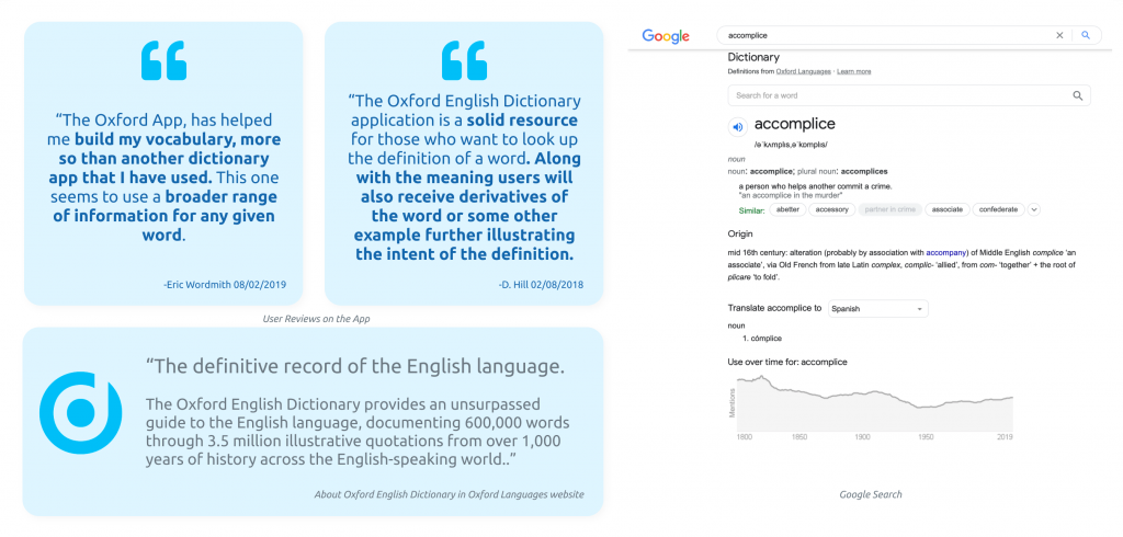
Data research on complete dictionary content
The word of the day was something definitely mentioned in the reviews and it seems one of the main features as it’s second in the rows distributions of the main page and the app gives you daily notifications. So I will decide to keep it. However most of the users found it annoying, the words are generated randomly and they were too basic and the notifications were said to be annoying..
Solution 1. Word of the day and secondary features hided on top menu
As the word of the day is something quite marmite, is either liked or disliked, but either way seems a very important part of the functionality of the app, it will still remain in the main screen but it will occupy a more modest part in the homepage, as a pop up when you click on the brand logo (Image on the left).
Other features as rating the app, inviting friends, getting to know more products and more brand info will be located on the top right menu a long with the rest of the features that were already there. (Image on the right).

Redesigned app: Word Of The Day and Main Menu
Experience #3 : The Dictionary
Problem 1. All of the dictionary features are separate islands
This is the main function, searching for a definition, it is now located on the middle of the homepage. However other dictionary options like pronunciation (“Say It”), synonyms and grammar (“Advanced Dictionary and Thesaurus”) are all separate Oxford apps. There is a pronunciation add-on in this app which is only unblocked when upgraded to premium however most user were complaining the pronunciation wasn’t clear. I had Say It for ages, I paid for a lifelong premium version and its a great app, although of course, it stopped working like many users said about the OED after paying and upgrading the phone, or in my cause iOS software upgrade.
This made no sense to me as if you remember, the brand described their mission as versatile and accessible.
I didn’t see this as integrated versatile content. Specially when if you were to search the word on google you get more content and more versatility. Why would you download the app then?
Solution 1. Making the Dictionary more Integrated, Accessible and Versatile

Redesigned app: Integrated usability
Now you can search in a specific dictionary, whether you are searching for the definition, pronunciation, its’ etymology, its’ use over time or how to use it grammatically. You can do all this from the main screen. The default option is dictionary (i.e. searching the word’s meaning) which will give you first the definition but you also get the option to expand other sections to get more insights of the word. Just as you were to do when you search it on google.
Oxford Dictionaries also takes pride in having their dictionaries in nine major world languages. Most people will use the app when learning languages and would benefit from switching dictionaries. This will contribute in making this app a great tool for learning as well as more versatile. “Unlocking the power of language for learning and for life, building and sharing language knowledge worldwide.”
Other user experiences
Providing the time would have allowed it, I would have also investigated into developing 2 other functions.
The Save Function
The save function: This is used by many users as I could tell by their feedback. Is a nice way to save your words in folders and come back to them when you need them. However this function is hidden in the menu and it isn’t visually appealing or specially funcional, plus has many bugs where the words just disappear. I think with a bit of time I could upgrade this functionality and make it fun to use.
Word Games
Some of the other Oxford apps have word games included. I think this is a fun idea and could also be integrated better in the app than just in the menu (as the current apps have).
This would just give extra reasons to use the app vs searching on your navigator (i.e. google), plus would make the learning experience more fun, open up to a wider audience and contribute to the brand’s mission. Developing beyond the role of a traditional dictionary publisher and being ahead of technology and innovation.
Final project reflection
I think the most challenging part of this project was not having access to internal user and app data, to have a broader knowledge of what currently works or doesn’t as I struggle to understand how this app can still be rated that high when it isn’t easy to use. To me this is the most exciting part of the project as I don’t believe design without purpose. So understanding the user needs and analysing the data is key to start dreaming about solutions.
However, I did my best analysing all the data I had and translating it into a better version of the app. Designing a more functional and more appealing app. I believe it matches the briefing and the brand core values.
During the process, I learnt how to cohesively develop an UX/UI project from start to finish. The art of storytelling while keeping it visual with the infographics.
Here is a summary of the main data research that was used during this project collected in an infographic.
I think this project adds to the rest of the my website to show I am highly motivated individual with a passion for learning and overcoming new challenges. From a background in automotive engineering and graphic design, certified on Six Sigma Lean Engineering and Problem Solving, I spent the last year self-teaching myself the skills to UX/UI design and basic coding in order to become a valued member in the tech and design industry.
Thank you for taking the time to read my project.
You can continue to learn more about me downloading my CV or checking my social media links below:
LAURA NUEDA ROMERO
2024